Tuesday, June 25, 2013

Area Estimation using Scilab

Our fifth activity in AP 186 is another fun activity. We are asked to estimate the area of synthetic images and try to do the same on images of real places using Scilab programming language. At first, I remember those areas of study that my VIP friends talked about and that I am always fascinated in listening. I think I could not explain it well like they did but basically it's about capturing images of the sea floor because you wouldn't want to touch or maybe destroy the treasures of the sea. Then from the images, not only the area but also depth, surface roughness and other important information can be obtained. These things would enable them to know condition of the corals and the like and would help them preserve our sea treasures. These things just make me realize more the importance of image processing. So, I might have now start doing our task. :)

Have some background study first! Green's theorem is a way to determine the area of a closed path. It is equivalent to the equation [1]


The double integral on left side of the equation represents the area enclosed by a contour. We can relate this to line integral over the contour traversed in counter clockwise direction. In discrete form, area can be computed as follows [1]


where x and y are the collection of points that traces the contour.

Now, for the activity proper..

First, synthetic images of square and circle were produced using the Scilab code (which is done in Activity 3). The images as a whole are both 100 pixels by 100 pixels but the size of the shapes vary. For circle, it has a known radius of 25 pixels and the square has a side equal to 50 pixels. 

ode for simulating a square synthetic image (top) and circle synthetic image (bottom). Beside them were the resulting synthetic images.

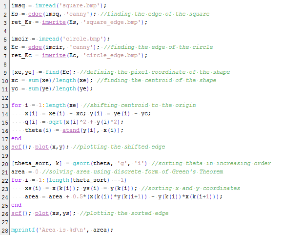
Using the function edge() of the scilab, the edge of the synthetic images were obtained. I encountered a problem where the code doesn't accept other images saying that the input image should be a single channel. The function only accept single channel images so you have to make sure to save the image as one channel. In using Paint, you have to choose the monochrome bitmap. Or you can also convert images to one channel in the code, I tried the function rgb2gray(), and it worked :). So moving on.. the edge() function needs an argument for the method parameter which can be 'sobel', 'prewitt', 'log', 'fftderiv' or 'canny' based on the Scilab help. The output images were shown

Resulting edge of the circle using the different methods: sobel, prewitt, log, fftderiv and canny (from left to right).

I choose best the 'canny' method because it outlines the edge with only thin line unlike others which are either thick or segmented. Then, the pixel coordinates of the edge are put into an array. The plot of the coordinates were shown in the figure below. However it was noticed that the coordinates were not sorted. To apply the Green's theorem, we want a sorted coordinates which traces off the edge of the shape. Sorting the coordinates with increasing angle would be effective. To do this, the centroid of the shape was found and the whole shape edge was shifted to the origin. The pixel position was then converted to their polar coordinates. Line 13-17 were designated to calculate the radius and angle values. Then, function gsort() was used to sort to increasing angle. What we really want to know is the arrangement of the indices of the angles to know which comes first, second, .. to last. We match this arrangement to the x and y coordinates. We can now apply the discrete form of the Green's theorem. Line 22-25 do the sorting and calculation of area.

Plot of the unsorted (left) and unsorted (right) coordinates of the edge of circle. 

The complete code was also shown below


The area for the circle was obtained to be close to the expected value. To check the credibility of the code, I tried other synthetic images (make the size bigger, shifted the centroid of the shape, other shapes) as shown below


The summary of the expected and actual area and the percent deviation were tabulated below. This shows a significantly small difference to assume that the technique used is reliable in getting the area of an image. 


Now, its time to put this in practical use. What if you want to know the area of a place? your favorite vacation destination? or even your house? I choose Lanao lake, which is the largest lake in the Philippines and its actual area can easily be googled to be 340 sq. km [2]. We would neep the map of Lanao lake, which was again taken from google maps. Using GIMP, the desired area was traced using magic tool and set similar to those of the synthetic images, black background and white shape. This is important since we are using the function edge(). The scale in the map was also used to relate the pixel to its physical area. From the code, the area was 59126.629 in sq. pixels. This can be converted to sq km using the scale found in lower left of the map about 66 pixel : 5 km. The computed area results to 339.34016 sq km with percent deviation of 0.19 to its expected area. We are now more convinced that this is an effective technique.

The map of the Lanao lake on top (taken from google maps [2]), synthetic image tracing the lake (bottom left) and the edge simulated by scilab (bottom right). 

In doing this activity, I have encountered many problems concerning the technique and how to incorporate it to the code. For that, I like to thank with all my heart my classmate, colleague, and best of friends, Nestor Bareza for patiently helping me.

I think I would rate myself 12/10 since I've done the main goals and the bonus part of the activity :)
____________________
References

[1] Soriano, M. "Area Estimation for Images with Defined Edges." AP 186 Laboratory Manual. National Institute of Physics, University of the Philippines, Diliman. 2013.
[2] Lake Lanao. Retrived from http://en.wikipedia.org/wiki/Lake_Lanao
[3] Lanao Lake, Philippines. Retrieved from https://maps.google.com/

Thursday, June 20, 2013

Image types and formats

I feel like our generation now is so fascinated with the digital world. Whether taking pictures, using in industry and other practical purposes, image representations are vastly used. For our fourth activity, we are asked to know and be familiar with the different types and formats of an image. At first, I thought that this will not be as exciting as the previous activities because you only have to research for the most part of it. But then Ma'am told us that image formats have its nature and reason why it is used. So, I may not know what I could discover.

A little exploration on the different image formats

Different image formats that I browsed in my personal computer and others that I searched on the web were shown below. The JPEG file is a picture taken by a camera, TIF file is a SEM (Scanning Electron Microscope) image of Indium Oxide, BMP file is obtained from [1] and the PNG file is obtained from [2].

Digital images with different formats: JPEG (upper left), TIF (upper right), BMP (lower left), and PNG (lower right).

And here is my favorite image file format, obtained from a dear friend of mine. 

An animated GIF image.

The properties differ for each of the image formats. Table below shows some of the important properties of the digital images.


It was observed that for JPEG and TIF, they have more properties. Aside from the Image and File properties indicated by blue letters in the first column of the table, there are Description, Origin, Camera and Advanced Photo properties. Camera properties include camera model, exposure time, ISO speed, etc. while advanced photo properties include lens model, contrast, brightness, saturation and other camera settings. However, most of them have no designated detail/ value. 


Differences on the image formats

As the image storage grows bigger and bigger, the need to compress image files also becomes greater. The knowledge about different file extension will help you save your image containing just the right amount of information that you need. The image compression can either be lossy or lossless. Lossy compression lets the image loss some of its information for smaller file size while lossless compression preserves every information about the image.

JPEG formats. One of the most common image file type (and the most format of image in my laptop) is the JPEG. This employs big compressing ratio, an optimized format for photographs – make use of digital cameras. Although, you can choose the compression of the images in the camera setting, the compression works based on how the human eye notices colors. It stores information to depth of 24 bits omitting the information that the eye least likely to recognize.

TIF formats. Though a flexible image format, TIF is exclusively for lossless image storage. Usually, it uses no compression at all which is used in high color depth images. In my example of TIF file format come from image taken by the SEM. The SEM, a property of the CMPL, captures images of the sample structures in sub-micron level. I thought that TIF format was used here because images of very small samples cannot afford any loss of information.

BMP formats. It is an uncompressed format used by Microsoft Windows graphics subsystem (GDI).

PNG formats. PNG is an image format that utilizes lossless compression. It finds patterns on the images for compression.

GIF formats. GIF format saves the images into 256 colors only. For true color images, which contains up to 16 million colors, losses much information when saves as GIF. It is used in line arts with only limited number of colors and for small animation like the image I presented a while ago.

RAW formats. RAW format is a lossless image storage that is available in some digital camera so if you would want the unprocessed version of photographs.

As a summary and what one can already deduce, less compression would result to bigger file size than those with bigger compressions. However, bigger compression would lose bigger information about the image. So image formats will help you choose the compression you want on your image.

[* Almost all information about different image formats are obtained from references 3-6. ]


Playing with the image color using GIMP

Exploring the JPEG-formatted image in GIMP, the following were found

Using GIMP, image properties (left) and the histogram (right) of an image can be displayed. 

The same image were manipulated using GIMP, producing effects or filters (see figure below). The effects used were grayscale mode, black and white (using only 1-bit pallete), and the indexed color (first blues then red). All were build-in settings in the GIMP but there were also menus (especially the colors menu) where you can made your own changes like for example, choosing the amount of color of cyan, magenta, and yellow in the picture. I tried the threshold settings where the produced image is on the middle right. Compared to the b&w image on the left, the details in the threshold-manipulated image is more prominent. So I think, depending on your taste, GIMP can possibly do it. And it was just so cool.

Manipulating a picture with the original version on the upper left.

When the image were manipulated, there are properties that were changed in the image. The obvious one is the size, which depends on the type that you choose or the color index.


The art in using Scilab

Images can also be controlled using Scilab. By installing SIVP module, a lot of commands are available to perform things done in the GIMP. Examples are imread, imshow, imwrite, imfinfo, etc. With the help of the Scilab help browser, using these commands had been easier.  Summary of the commands that I learned to use is presented in the code below.


Each line contains comment explaining what it do. In using im2bw in line needs an argument named threshold which, as described in the Scilab help, is a value from 0 to 1 describing the amount of luminance  which then dictates the bound for which pixels should have a true and false value, or the white and black color. In line 4, info will contain the properties of the penguin image. When typed in the console, the information that were obtained were tabulated below.


The rest of the code simply manipulates the color of the original image. The difference between the imshow and imwrite is that the latter save the image into the file while the other just displays it in a window. The original image can also be converted to other formats as performed in line 7 and obviously its size was drastically changed from 2.25 MB to 112 KB. That is from lossless to lossy (compressed format).  The size and the color type for other converted images were also changed. The original compared to the converted images were presented in the succeeding Figure.

Manipulating a picture using Scilab. The original image is on the upper left, grayscale on upper right, black and white on lower left and applying filter on lower right. 

I give myself a 10/10 :)

***
I am very thankful to a loooot of people for the content of this blog.

I thank Phoebe Gallanosa for letting me use her list of image properties so all I need to do is to fill up the details. It's just sad that I wasn't able to use a big portion of the list because for most images, it was not filled up.

I acknowledge the Condensed Matter Physics Laboratory facilities particularly the SEM where I get the image of the Indium Oxide structure.

I would also like to thank Aeriel Constantino and my highschool friend, Crisilyn Paguio, with whom I got the picture in the grassland and the gif picture both taken way way back.

I thank Nestor Bareza for helping me install the SIVP module in my laptop and teaching me to use few common commands.


_____________________________________
References
[1] http://www.goldenborders.com/graphic/Miscellaneous/miscellaneous%20(136).bmp
[2] http://upload.wikimedia.org/wikipedia/commons/e/e6/Big.Buck.Bunny.-.Landscape.png 
[3] Soriano, M. "Image Types and Formats." AP 186 Laboratory Manual. National Institute of Physics, University of the Philippines, Diliman. 2013.
[4] Digital Image File Types Explained. Retrieved from http://users.wfu.edu/matthews/misc/graphics/formats/formats.html
[5] Aguilera, P. Comparison of different image compression formats. Retrieved from http://homepages.cae.wisc.edu/~ece533/project/f06/aguilera_rpt.pdf?ifr
[6] Graphics Interchange Format. Retrieved from http://en.wikipedia.org/wiki/Graphics_Interchange_Format

Thursday, June 13, 2013

Getting to know Scilab

Time for another blog! :) For another exercise in AP186, our third activity covers the introduction to Scilab. I've been familiar with Scilab last semester because that is the programming language I used in AP185. We've been able to plot sinusoids, perform convolution and get its Fast Fourier transform, etc.. importing, getting information from sound file... I hope my little background on the said programming language could help me in the incoming "code" exercises throughout this semester. (cross finger) :)

For our practice, a code presented below was provided to create a centered circle. Figure below shows the output of the Scilab code execution. As an aperture, this synthetic image is useful in optics, one field of physics which is somewhat boring because there's endless lens and mirrors. different kinds and combination of them.. but, ironically, one topic that I enjoy because it is pretty geometric in approach and I love my high school geometry.. and it is relatively easier topic (I think) among all physics courses..


Now, we were asked to simulate the other synthetic images on our own. They were as follows:
  • centered square aperture
  • sinusoid along the x-direction (corrugated roof)
  • grating along the x-direction
  • annulus
  • circular aperture with graded transparency (gaussian transparency)
Hmm.. okay, what to do? Of course, I need to understand the provided code first. Let’s analyze the lines one by one. Up to line 3 were easy to understand. It is the usual setting of range of values with the chosen number of points or interval. Line 5 would be the equation of the circle. Line 6-7 would set the condition of the part of the circle that would be color white and black represented in matrix form with 0 equivalent to black and 1 equivalent to white. The remaining lines would be responsible for the plotting. 

Now, time for coding! The Scilab Help Brower had been my best friend in this activity. Given the code, the image that would be easy to do next is the annulus. The condition must only be altered to choose the part of the matrix to be equal to 1. Same was done for the square, just the equation of the circle could be omitted. The difficult parts were the sinusoid, grating and aperture with graded transparency. 

I immediately thought that for the grating, you could only just put all the conditions that were needed. As you can see in the code at the end of the post, a long list can be seen. However, I then thought that what if I would like different grating width, very narrow widths. Then, I would need to have a long list. I planned on making a loop instead but I think I would have no time.

I have asked my classmates about this matter but my seatmate Anjali Tarun was also experiencing the same problem. But then she thought of using the sine function and that pretty much worked! So I thank Anjali Tarun for helping me understand the advantage of the sine function to construct my code for grating. And another thing is.. using the plot3d() function of Scilab, the grating code would also result to the corrugated roof. For the circular aperture with the graded transparency, I am acknowledging the help of Eric Limos, Nestor Bareza and a lecture from the website of University of Ottawa*. Because combining all the ideas that they provide me, I am able to have an equation of the Gaussian function. 

gauss = exp(-((X.^2)+(Y.^2))/(2.*(0.4^2)))

This would be a two-dimensional Gaussian function, centred at the origin with r equal to 0.4. I am also thankful to Chester Balingit for teaching me how to converge it to circular aperture to produce a graded transparency. This also gave me the idea on how to do the exploration part of the activity. I tried on subtracting square aperture from the circle and the result is shown in the figure below. There, you can also see other image outputs.


I would rate myself 10/10. I wish I could make other and a bunch of fancy images and explore other things to do.
_____

* Plotting 2D Functions. University of Ottawa. Retrieved June 13, 2013 from http://www.site.uottawa.ca/~edubois/courses/CEG4311/plotting_2D.pdf

Tuesday, June 11, 2013

Reproducing data from digitally scanned graphs

In our second activity in Applied Physics 186, we've been asked to reconstruct graphs that can be found from journals, books, or papers. For me, I find the activity exciting because the desired output graph should be of very high resemblance to the original. I like the challenge. And I always enjoy challenges (or maybe because I think that the activity was so demanding but I believe it can be done simply :P). It's also very interesting because this can just be done using only common applications like Paint and Microsoft Office Excel or other spreadsheet applications.


The figure above is the scanned image of the graph that I would reconstruct. This is from the journal, Effect of Laser-Induced Collisions on Chemical Reactions, Sister Kathleen Duffy, Proceedings of the 4th National Physics Congress, 1985. I would like to express my sincere gratitude to Abby Jayin and Chester Balingit, from whom I acquire the scanned image. 

First, the image was opened in GIMP, though Paint could also be used. I just used GIMP because this application is new to me and I would like to be familiar with it. The application has many tools and options that I think have many practical uses, which I would need to learn in preparation for my thesis :)  With the help of my very patient, understanding and pretty classmate, Phoebe Gallanosa, familiarizing with GIMP had been a lot easier. And for this, I am very thankful to her. 

In these image editing applications, positions of areas or points in any image can be defined numerically through its pixels. Pixel locations are usually found at the bottom of the application window. The scale of the actual unit or division in the graph with respect to the pixel was identified for both x- and y-axis. The scales were found to be 93 pixel/cm(unit of x-axis) and 23.2 pixel/arb.unit(unit of y-axis), respectively. The pixel locations of the data points in the plot were also recorded. I only considered the plot with the dashed line. At first, I found it difficult to relate the pixel to the actual values. The orientation of the pixel values (especially the y-axis) was just confusing. But then, I learned a trick. I found the pixel location of the origin (538, 590) important. I should have understand the correct shifting to consider the position (538, 590) to be (0,0) then use the scales to tranform pixel to actual values. The recorded pixel locations can then be converted to its actual measurement using the equations: 

xactual = (xpx - 538) / 93
yactual = (590 - ypx) / 23.2

where xactual and  yactual were the actual values of x and y; and xpx and ypx were the pixel values of x and y. 

Having the actual numerical values of the points, obviously, the plot can now be reproduced. The numerical data were all recorded in Excel and the points can readily be plotted. However, one big problem that I encountered is to find the perfect curve fit to the data, preferably similar to the fit of the original graph. No built-in trendline in the Excel produced a nice curve fitting. I think if I would want to copy the same trendline, I would need to read some parts of the journal in order to know the suitable curve fitting or maybe there's equation the author/s had used. 


The figure above shows my output. The original graph was overlaid into the reconstructed plot using some format in the Excel. Checking the resulting graph, I am overjoyed because the new data and the actual ones were very closely matched. In the figure, the red dots show the reconstructed plot. I think I would rate myself 11/10 because I believe I have generally accomplished the goal of the activity and the bonus part. I just feel a little unsatisfied not being able to reconstruct the curve fit of the data.